

Brand Strategy
Dairy Witch
This brand strategy is designed to transform a typical ice cream business into a memorable and engaging brand, leveraging your existing identity and unique assets. The goal is to build a strong, recognizable brand voice that fosters customer loyalty and drives growth.
Brand Identity and Story
Your current identity—a witch silhouette, a witch-hat-wearing ice cream cone, and a red, black, and white color palette—is a fantastic foundation. Let's fully lean into this theme.
Brand Name: "Dairy Witch" This is a playful, name that’s easy to remember and directly links your product to the witch theme. It suggests something a little mischievous but ultimately delightful.
Target Audience
Your target audience is broad, but let's define them more specifically to tailor your messaging.
Primary Audience: Families with young children (ages 3-12) and teenagers. They are drawn to the whimsical, fun, and slightly spooky theme. The playful witch character is non-threatening and appealing to this group.
Secondary Audience: Nostalgic adults (ages 25-50+) who appreciate a local, independently owned business with a unique story. The classic Northeast American ice cream products will appeal to their sense of nostalgia.
Core Values
These are the guiding principles that define your business and its actions.
Quality & Craftsmanship: You take pride in making high-quality, delicious products. You use the best ingredients and traditional recipes.
Whimsy & Fun: You don't take yourselves too seriously. The brand is about creating joy, making memories, and having fun.
Community: You are a neighborhood spot where people gather. You are committed to being a positive part of the local community.

Brand Voice and Tone
Your brand voice should be as unique as your theme.
Voice: Whimsical, playful, and a little bit enchanting. Use language that reinforces the magical theme, like "enchanting flavors," "magical concoctions," or "brewed with care."
Tone: Friendly, welcoming, and slightly mischievous. The tone should be consistently lighthearted and fun.
Marketing and Communication
Social Media:
Instagram: Visually appealing content. High-quality photos and videos of products. Use captions with ("Our Witches' Brew Frappe is a spell-binding treat!") and engage with your followers. Host polls like "What spell should we whip up next?" to drive engagement.
Facebook: Use Facebook to announce new flavors, special events, and promotions. Share customer photos and reviews to build community and social proof.
In-Store Experience:
Themed Menu: Rename your products to fit the theme. For example, a frappe could be a "Potion Potion", a chocolate soft-serve could be a "Midnight Magic", and a classic vanilla milkshake could be "Witch's Brew".
Seasonal Campaigns:
Halloween: This is your peak season. Create special limited-time flavors like a "Pumpkin Spice Potion" or a "Candy Corn Cauldron." Decorate the store heavily and encourage customers to come in costume for a discount.
Christmas/Winter: Offer seasonal flavors like "Gingerbread Spell" or a peppermint frappe called "Peppermint Frost." The witch theme can be adapted to be more cozy and festive.

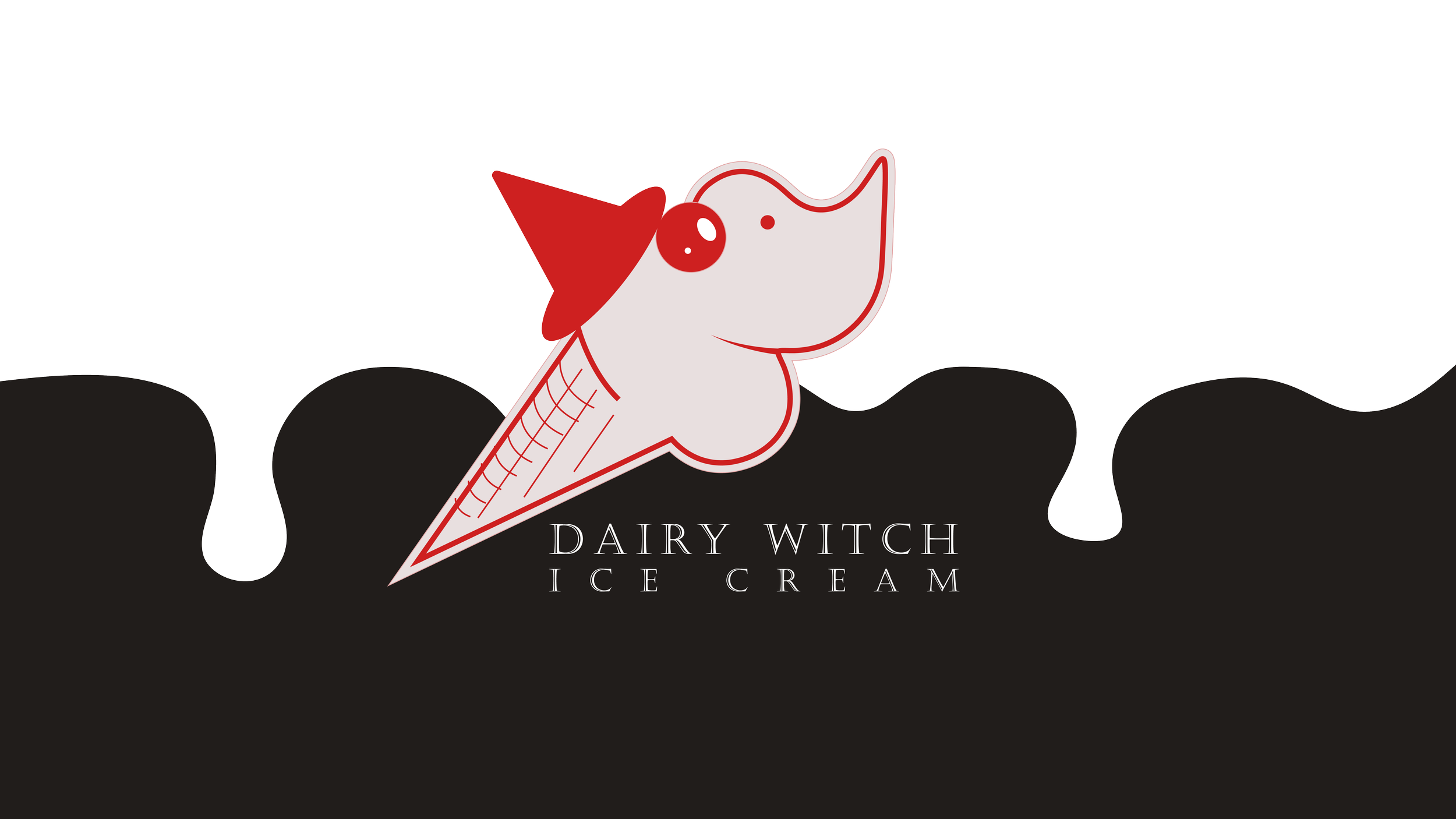
Logo

Dairy Witch is designed to capture the brand's enchanting mix of tradition and playful magic.
The Primary Logo is a vibrant and nostalgic nod to our origins. It uses the classic red, black, and white of our hometown, featuring a soft-serve ice cream cone transformed into a whimsical witch with a creamy nose and a pointy hat. This design is perfect for our main signage and brand identity, instantly communicating the fun, and magical spirit.
The Simplified Mark is a modern and versatile take on the original. This clean, two-color design in red and creamy pink distills the identity down to its core elements. It's a highly adaptable asset, making it ideal for everything from social media profiles and custom merchandise to on-the-go packaging.

#e8dfdf
R: 232
G: 223
B: 223
#d9372d
R: 217
G: 55
B: 45
#000000
R: 0
G: 0
B: 0
Color + Typogoraphy

The Castellar Regular font is a serif typeface known for its distinct, chiseled appearance. Its design evokes a sense of permanence, formality, and tradition. The sharp serifs and capital-only letterforms give it a classical, almost monumental feel, reminiscent of inscriptions on Roman buildings or historical documents.
Historical and Traditional Feel: The font's design directly links it to historical and classical aesthetics. This makes it an excellent choice for a brand that wants to convey a sense of heritage, longevity, or a deep connection to the past, like a brand tied to Salem, MA.
The color palette of red, black, and white is a classic combination that is visually striking and loaded with symbolic meaning. This particular combination is also strongly tied to the traditional imagery of Salem, MA, making it a very effective choice.
Black: Black is a color associated with power, sophistication, and mystery. In the context of Salem, it directly relates to the historical themes of witchcraft and the unknown, offering a nod to the city's unique history. It provides a strong, bold foundation for the logo and identity.
White: White represents purity, clarity, and simplicity. It provides a clean, stark contrast to the black and red.
Red: Red is a highly emotive color that signifies energy, passion, and danger.
The combination of these colors creates a balanced yet dramatic look. Black and white provide a timeless, sophisticated base, while red adds a jolt of energy.