Brand Strategy
Brand Identity + Positioning
Brand Purpose: To introduce a new, refined take on Japanese soba, transforming it from a simple, everyday noodle dish into a sophisticated culinary experience that honors the traditions of Kyoto while appealing to a modern palate.
Target Audience: Discerning food lovers, urban professionals, and culturally-curious diners aged 25-50 who appreciate quality, craftsmanship, and a minimalist aesthetic. They are digitally-savvy and seek out unique, authentic, and "Instagrammable" dining experiences.
Unique Selling Proposition (USP): Kyoto Soba is not just a soba shop; it's a celebration of soba as an art form. We offer a curated, chef-driven menu of refined soba dishes, presented with meticulous attention to detail, in a serene and minimalist environment. Our brand bridges the gap between traditional Japanese culinary heritage and modern, trendy dining culture.
Narrative
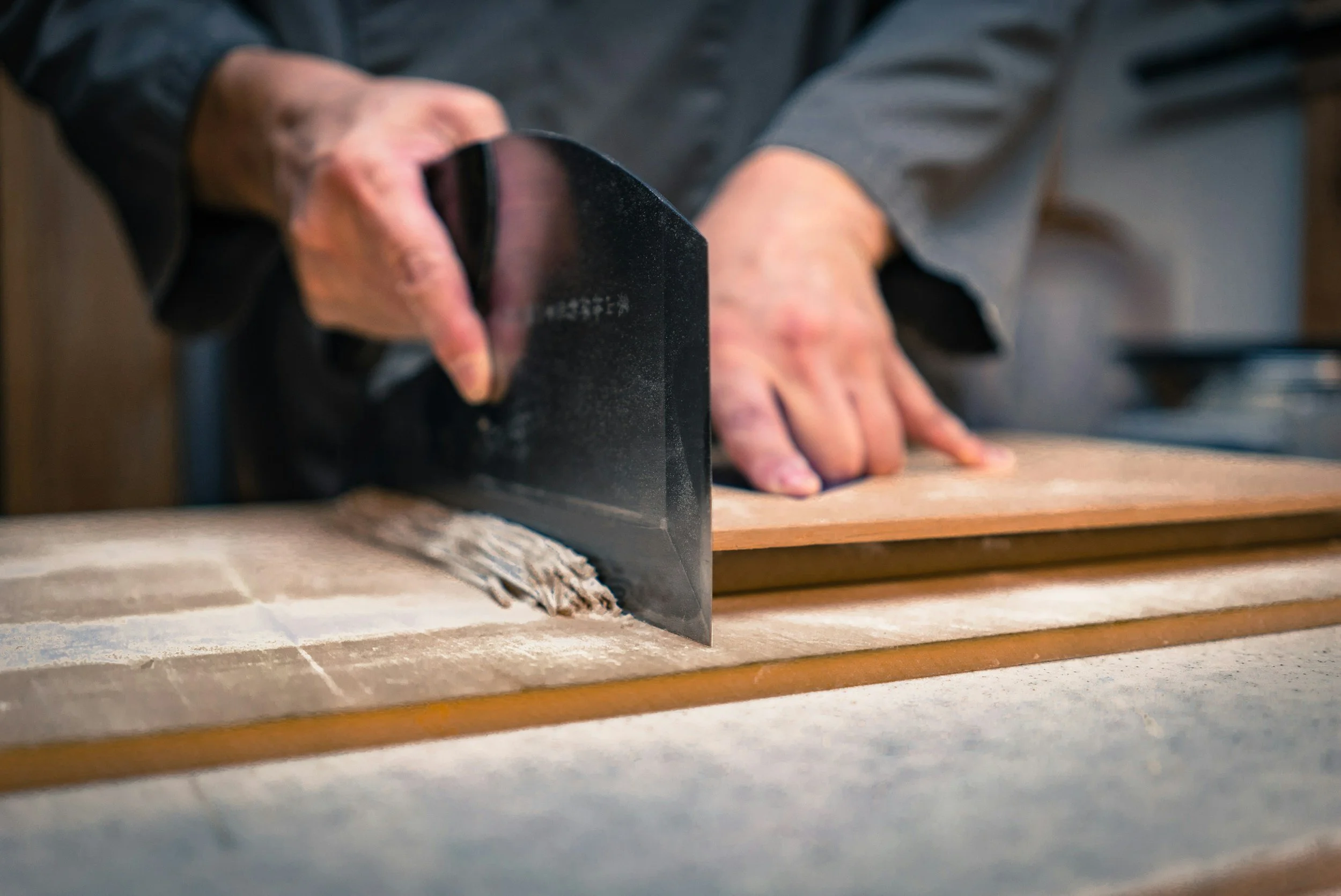
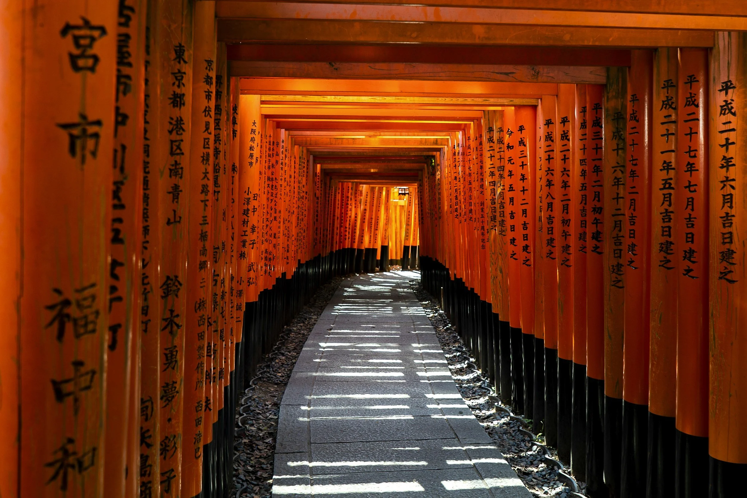
Our story begins in the ancient heart of Japan, in Kyoto, a city synonymous with grace, beauty, and refined craftsmanship. Kyoto Soba is a tribute to this heritage, focusing on the humble buckwheat noodle and elevating it to a new level of sophistication. We honour the time-honoured techniques of soba-making, from stone-milling our buckwheat to hand-cutting each noodle, ensuring a flavour and texture that is unparalleled. This is a journey that connects the past with the present, a tranquil escape from the urban hustle where you can discover the quiet beauty of soba.
Brand Experience
Culinary Experience:
Menu: A concise, hyper-focused menu of both hot and cold soba dishes. We will feature signature dishes that are unique to us, such as "Seasonal Soba" that changes monthly based on local and premium Japanese ingredients.
"Soba-mae" (Sake & Small Plates): A key part of the experience. We will offer a refined selection of high-quality sake and artisanal small plates to be enjoyed before the soba, encouraging a leisurely and complete dining experience.
Presentation: Each dish is plated with an artistic, minimalist aesthetic, using bespoke or handcrafted ceramic bowls that complement the natural beauty of the food.
Physical Environment:
Interior Design: A tranquil, minimalist space inspired by Kyoto's aesthetic. We will use natural materials like light-colored wood, stone, and subtle textures. The design will feature clean lines and soft, intentional lighting to create a sense of calm. A subtle "pop" of a trendy, unexpected color which would be used in an unexpected way.
Service & Presentation: Every interaction with our staff, from the warm welcome to the graceful presentation of the food, will be part of the brand experience. Staff will be knowledgeable about the soba-making process and able to offer recommendations on pairings.
Marketing + Communication
Visual Identity: The logo, color palette, and typography will be clean, modern, and minimalist, with a hint of Japanese elegance.
Digital Presence:
Website: A beautiful, clean, and mobile-responsive website with high-quality photography, an easy-to-use reservation system, and a brief section on our brand story and the soba-making process.
Social Media: Instagram and TikTok for visual storytelling. Our strategy will focus on high-quality photos and engaging, short-form videos showcasing the behind-the-scenes artistry of soba making, the beautiful plating, and the serene ambience.
Content: content around culinary trends like hyper-seasonal menus and chef’s tasting experiences. We will encourage and re-post high-quality user-generated content from our customers to build community and authenticity.
PR & Collaborations: We will strategically partner with local food bloggers, micro-influencers, and design publications whose audiences align with our brand's sophisticated and aesthetic identity. Our PR efforts will focus on lifestyle and culinary features, highlighting the unique experience and design of Kyoto Soba.

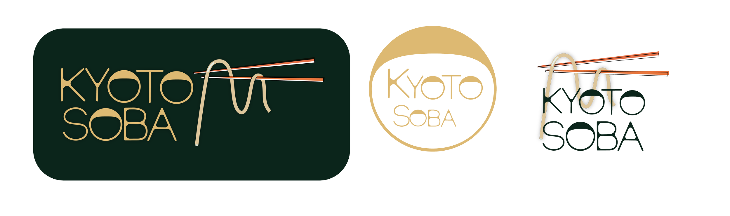
Logo
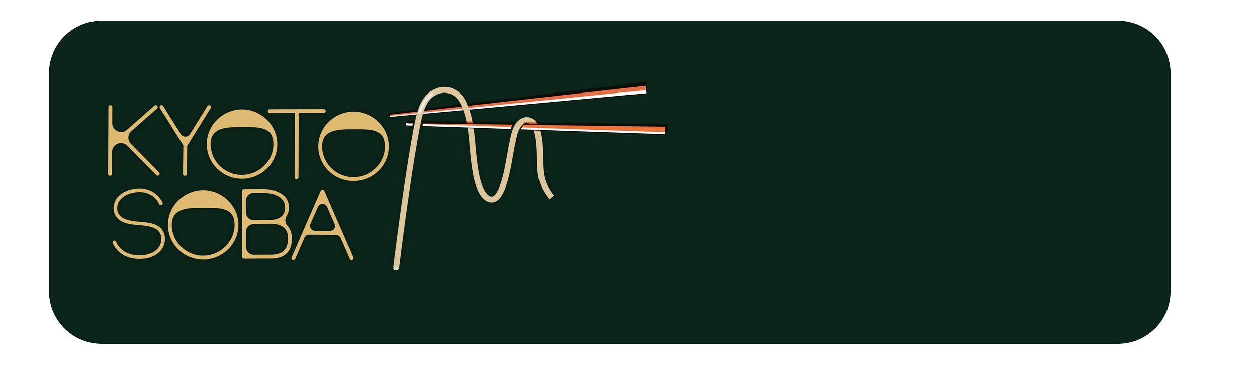
These logo variations for Kyoto Soba present a cohesive yet versatile brand identity, masterfully blending clean, modern design with traditional Japanese elements. The primary logo, set against a rich hunter green background, commands attention with its sleek, edited typography that features soft, radiused edges. The tan text stands out, with the letter "o" in both Kyoto and Soba stylized to resemble a traditional soba bowl. A single soba noodle, suspended from a pair of chopsticks, dangles gracefully from the top of the logo, its bright orange accents adding a contemporary pop of color.
The second design simplifies this concept, placing the elegant, tan-colored text—complete with its unique "o" bowls—within a circular, tan-filled shape, offering a sophisticated, minimalist emblem perfect for a website icon or social media profile.
The third variation revisits the initial design, retaining the same custom typography and noodle-and-chopstick motif but with a different noodle placement, demonstrating the logo's adaptability across various applications while maintaining a unified and recognisable brand aesthetic.
Color + Typogoraphy
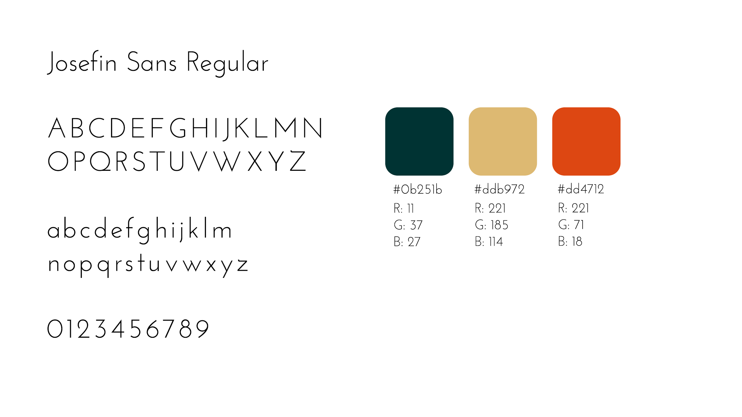
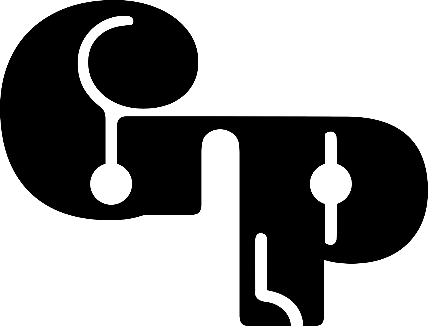
For the Kyoto Soba project, I developed a custom typeface that embodies the principles of Japanese minimalism. I started with the clean, geometric structure of Josefin Sans Regular. I then precisely edited the edges of the characters to introduce a subtle softness and enhance their visual appeal, without sacrificing the font's legibility or its elegance.
This refined typeface now complements the brand's aesthetic, which is simple and refined. The modifications I made add a unique touch of visual interest that sets the font apart from its original form. The result is a bespoke font that effectively communicates the brand's sophisticated and serene identity, making it a key element in the overall design.