GRAPHICS & ANIMATION
Lightup Movement
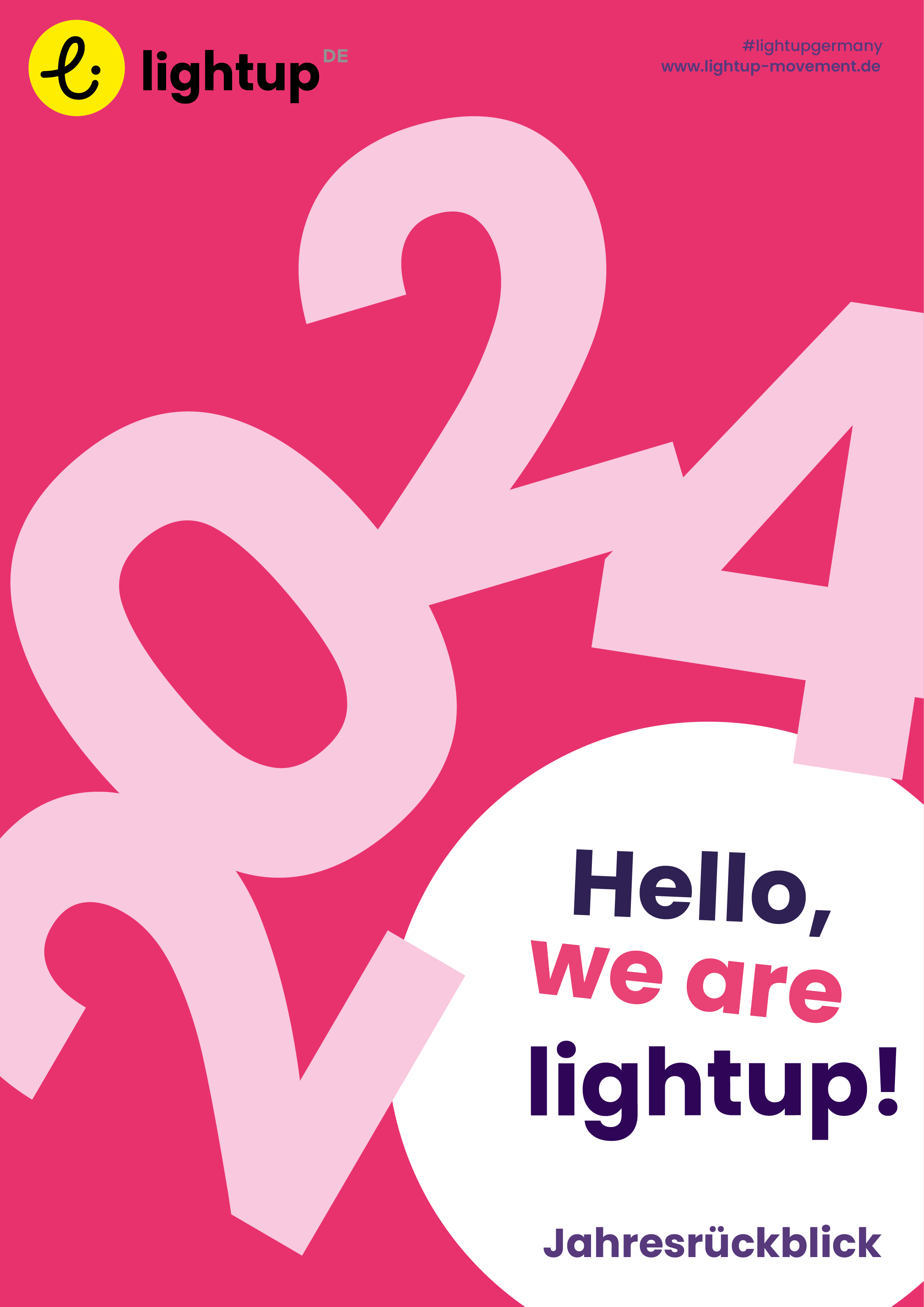
My collaboration with a non-profit dedicated to combating human and sex trafficking involved crafting impactful and optimistic imagery for their annual magazine. My goal was to infuse these vital publications, which cover various social projects and public awareness campaigns, with a sense of positivity and playfulness. Through the strategic use of vibrant colors, rich textures, and imaginative compositions, I transformed potentially somber subject matter into visuals that convey hope and resilience, aiming to inspire engagement and support for their crucial mission. The accompanying image on the left provides a glimpse into the kind of work I produced for their yearly report, showcasing how design can powerfully communicate even the most sensitive of topics.
BRAND & LOGO
Font: Manjari Thin Edited/re-designed by me
ADD COLOR IMAGES
ADD HEX/CMYK
DESCRIPTION OF PROJECT

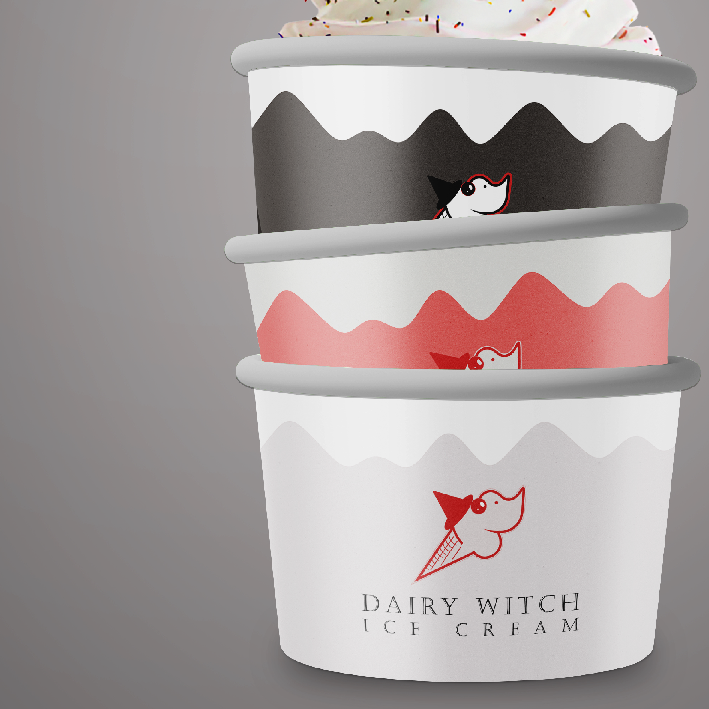
Re-Brand

For a passion project rooted in nostalgia, I undertook a complete rebrand of a beloved ice cream shop in my hometown. The original establishment featured a charming, albeit dated, witch icon. My vision was to harmoniously blend this iconic witch with the whimsical essence of ice cream, creating a fresh identity. To deepen the local connection, I meticulously integrated the city's school colors into the new design palette. The result is a vibrant and playful brand that pays homage to its roots while offering a modern, captivating aesthetic, perfectly capturing the magic of a cherished local spot.